When it comes to painting a room, there’s no limit to your choices for paint colors. But if you’re trying to avoid decision overload by going for a simple white, however, you may need to think again.
 “The misconception of white paint is that white is white,” says JBDB’s designer Emily Thull. “White is actually really easy to get wrong. The wrong color white could come off looking pink, yellow, or blue in the room.” So before you get your rollers out, here are some tips to consider before picking out the perfect shade of white paint.
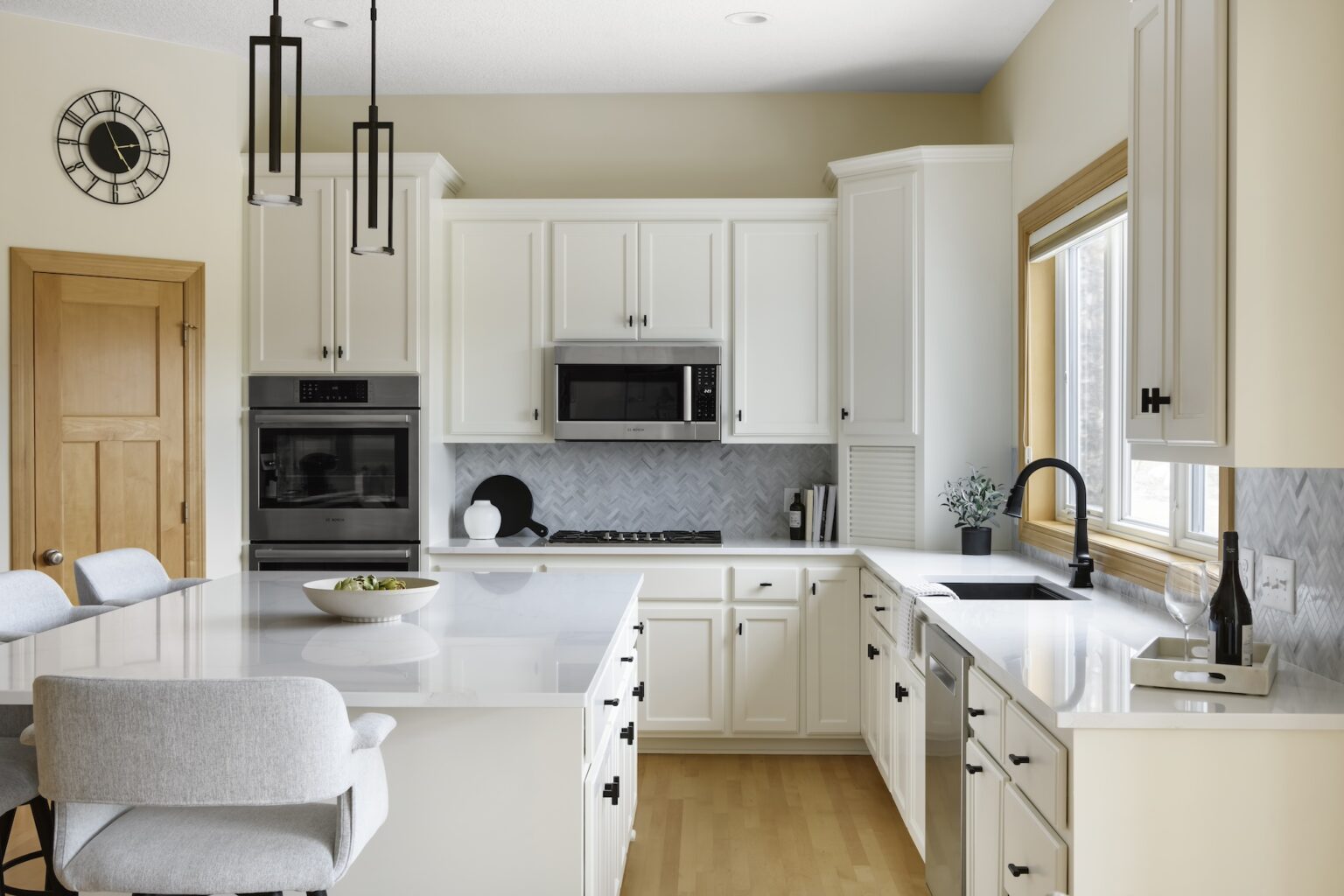
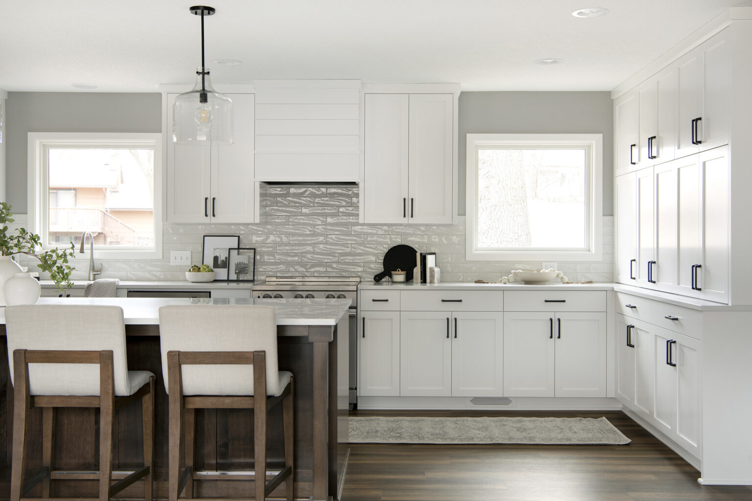
1) Pure white is not always right
Stark whites can come off as too harsh in many rooms. To avoid an overly bright, sterile look, you’ll want to pick a white that has some undertones to it. One of Emily’s go-to whites is Sherwin Williams’ 2016-2017 Color of the Year, “Alabaster.” This option is a creamier white, but doesn’t appear too yellowish. This color creates a warm and comfortable feel, making it a good choice for a kitchen or a sun porch where you’ll want an inviting environment.
Another popular paint is Sherwin Williams’ “Pure White.” This color leans toward more of a true white, but it still has warmer undertones. This color white would fit well in a more modern, contemporary room design.
Benjamin Moore’s “Cloud White,” while not as creamy as the “Alabaster” and not as white as “Pure White,” is a versatile choice for both a modern, contemporary style, as well as a warmer, more traditional space.
2) Check your lighting
 If you’ve narrowed down your paint options, it’s important to look at your paint swatches at different times of day and in different lighting. Even with a white paint, it can look different in morning light, bright afternoon sun, or during the evening. And if the room gets a lot of natural light, it can bring in different undertones depending on if the room is south-facing, northwest-facing, etc.
3) Think about your surroundings
When thinking about your paint choices, you’ll want to keep the big picture in mind and see how all the different materials in the room will work together before settling on a swatch.
 Though it’s possible to design a room around a predetermined paint, it’s more common to pick out interior finishes such as tile, countertops, and flooring first and then select a paint color to coordinate with those materials. “There are an infinite number of paint colors to coordinate with your interior finishes, furniture, art, rugs and textiles,” said JBDB’s designer, Samantha Schmitt.
But if you’re set on white paint from the get-go, consider the best applications to incorporate it into the space. “If we know you want to use white paint at the beginning of a project, we can base other elements of the room around the color,” said JBDB’s designer, Samantha Schmitt.
For example, in a contemporary space, you may use white walls as a canvas to add accent colors throughout the room with a bold sofa, artwork, or rug. In a more traditional space, using a creamy white on millwork like wainscoting, crown moldings, or beadboard will create warmth.