Rustic & Inviting
Main Level Renovation
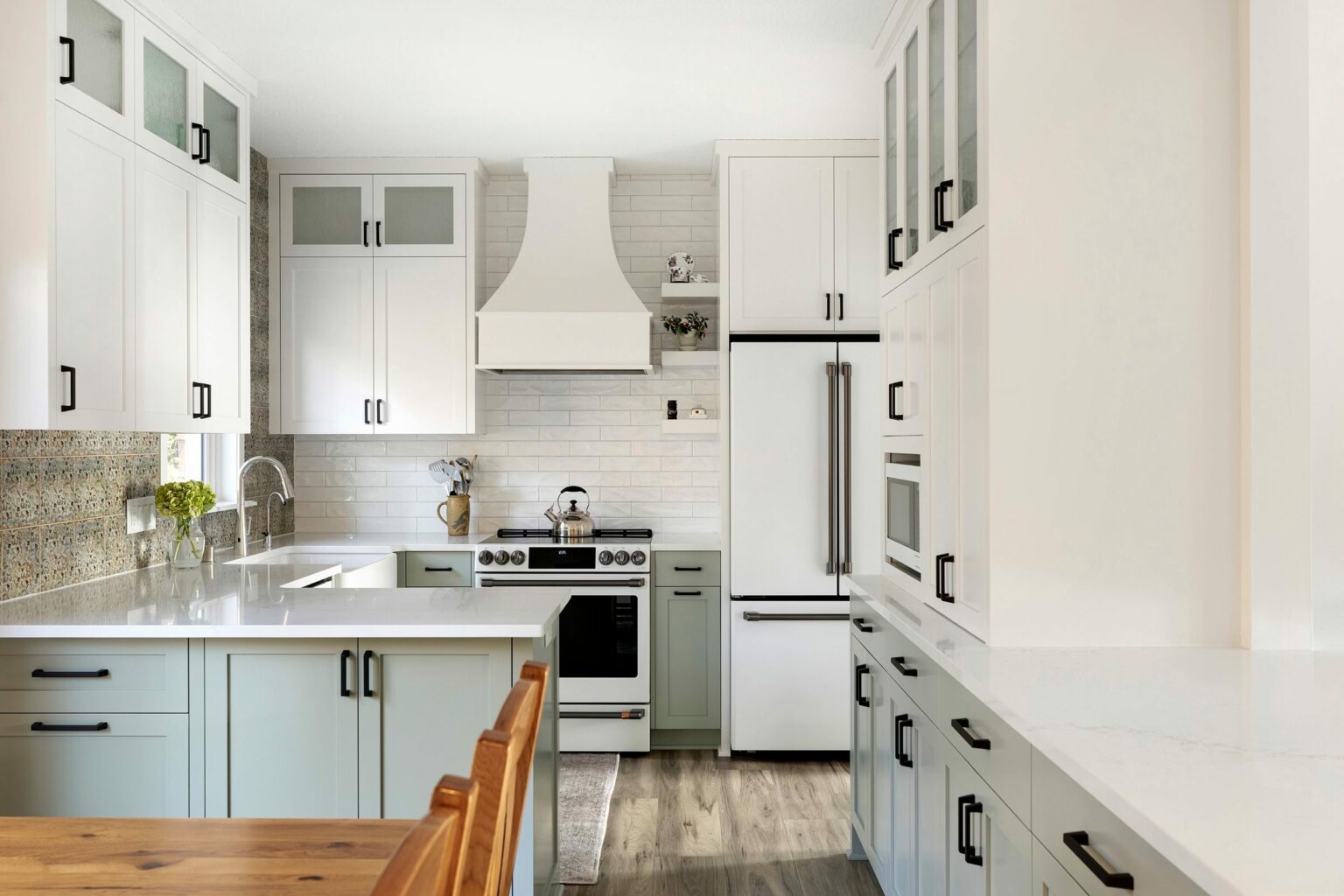
If you’re struggling with the size of your kitchen, you might think you need to invest in a complete overhaul. But the reality is that you can change the look and feel of your kitchen without disrupting the existing floor plan. We recently finished a kitchen remodel out in Burnsville, Minnesota that completely transformed this space, giving it an updated, fresh feel.
Our first priority was a complete gut of the room. By removing the soffits and one wing wall we were able to open up the room, giving us additional height and more storage options.
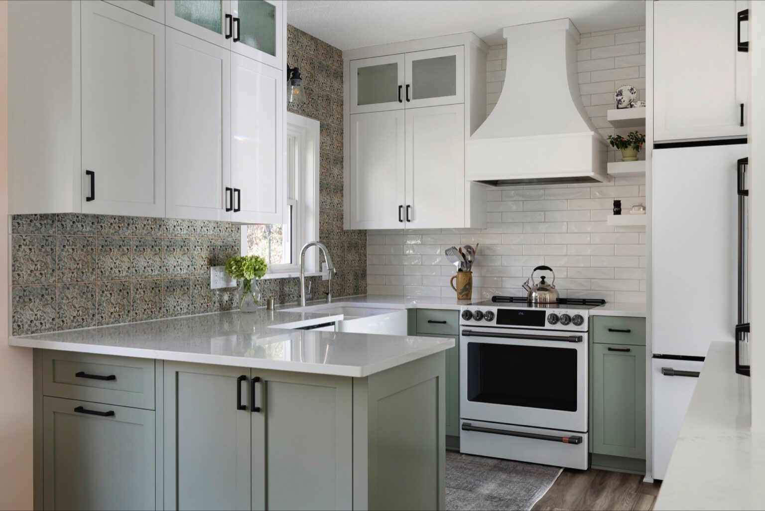
Our goal was to brighten up this room, with the chosen design elements and the addition of recessed cans, we were able to achieve that goal. To help execute this plan, we decided on matte white GE Café Appliances and Quartz countertops. Custom cabinetry helped elevate the room’s design, and extending cabinetry all the way to the ceiling gave us more storage and height!

For the hardware, we went with matte black for a sleek, contrasting look. Schlage was used for the door hardware, Amerock for the cabinet hardware and we completed the look with a fireclay farmhouse sink, perfect for food prep and dish washing.
The cabinet colors we chose were:

While the transformation creates a brand new look, we didn’t have to move any major walls for this remodel. By simply taking out the dropped soffits we were able to expand upwards, creating the illusion that the kitchen was bigger! The kitchen was immediately more functional, with added, accessible storage space.
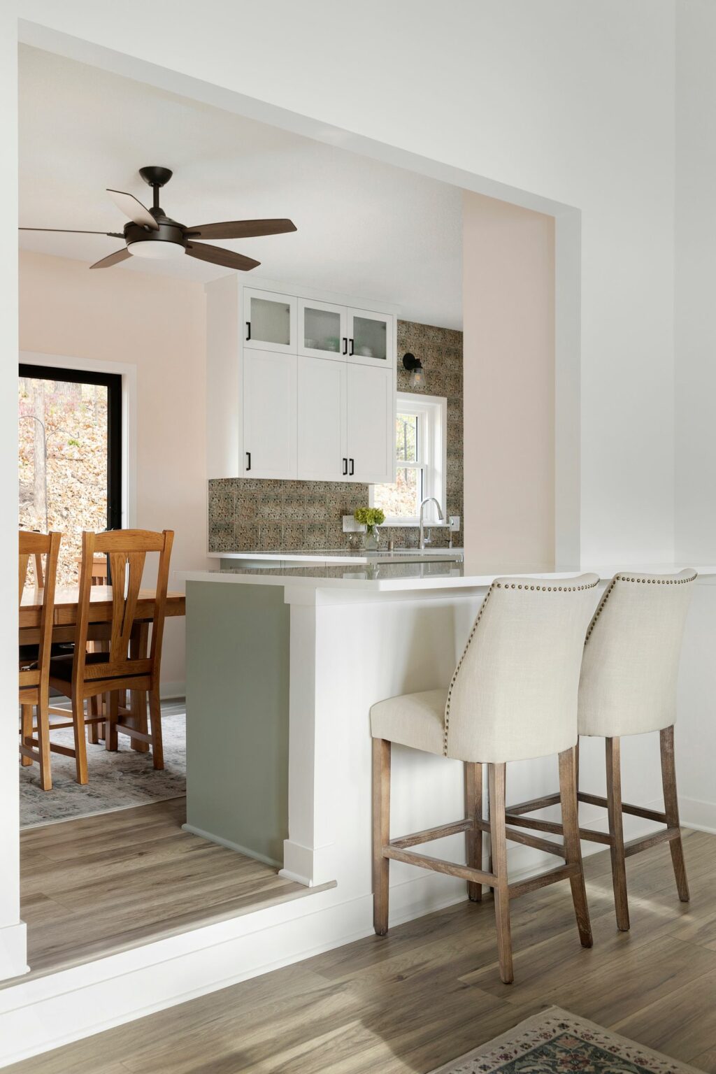
There was an unused half wall between the kitchen/dinette and living room. To maximize space we added cabinetry on the kitchen side and did an overhang to the living room side so we could add seating and a countertop.

We wanted to incorporate visual interest to the design, so we used two different tile backsplashes. We positioned the one at the kitchen sink wall as the decorative focal point and then to compliment that bold styling, we decided on a simpler white subway tile at the kitchen range wall. Both tiles share a handmade quality which helps provide a cohesive look.
The Tile Designs Used

However, we didn’t just remodel the kitchen—the laundry room, front entry/mudroom, and living room got brand new looks as well!
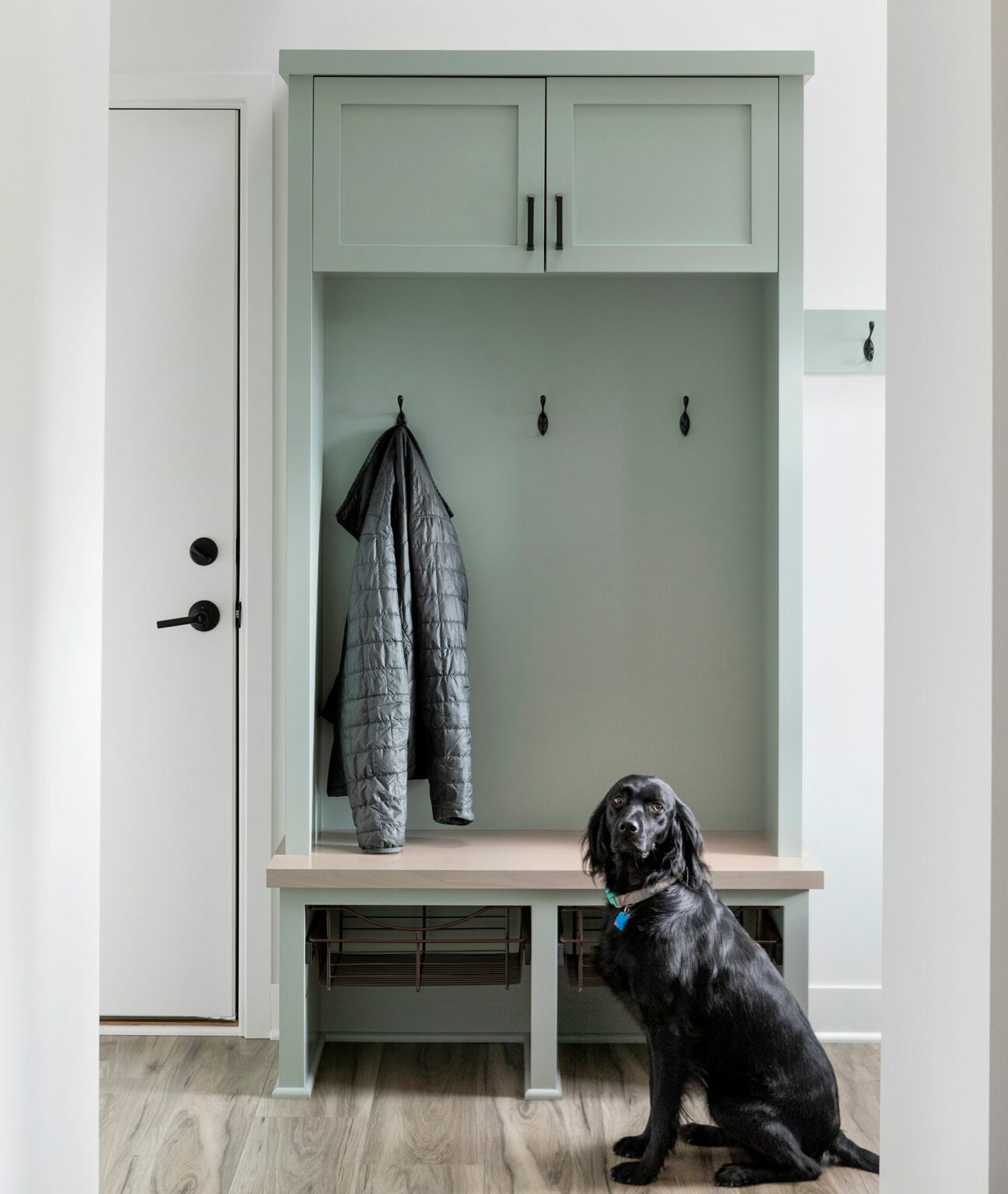
For the laundry room, we added cabinetry, new flooring, and millwork to give it a spruced up look. New paint was in order, as well as new light fixtures.Then for the front entry/mudroom we added flooring, paint, millwork, new light fixtures, as well as custom lockers with a built-in bench.
“Having a locker in your mudroom gives you and your family a designated spot to store all of your winter gear so you don’t track mud and snow through the house,” says Kayleigh Queoff, one of James Barton Design-Build’s designers. “And a combination of open and closed storage means more streamlined organization, and a hidden place to store hats, gloves, and other items”.