

Reviewed By:
The perfect paint shade can dramatically change the look of your living spaces. When planning a remodeling project, choosing the right paint color will help bring everything together. But when remodeling, it’s not just about choosing a color you know looks good in your space. You have to consider how a paint color will look with new fixtures, finishes, and layouts, which may lead you to gravitate towards entirely new colors to suit your space.
At James Barton Design-Build, color is a big part of the design discussion. But with an infinite number of shades, colors, and gloss finishes, it can still be intimidating to try and narrow down to just one choice. Let’s explore what you want to consider when choosing colors so every detail of your design feels intentional and cohesive.
Why Paint Colors are Important for Remodeling
Painting the walls is one of the easiest steps in a renovation project compared to the demolition and construction phases. But just because it’s easy to paint doesn’t mean it’s easy to pick the right color.
In a renovation, you’re choosing paint for a space that hasn’t been created yet, which requires a completely different mindset than picking colors for an existing room. It’s less about finding a color you like and more about choosing a shade that ties the whole design together.
Popular Wall Color Options for Remodeling
Certain colors show up repeatedly in remodeling projects, and for good reason. Light and neutral colors tend to go with everything. But that doesn’t mean you have to pick a paint color just because it’s popular. Here are a few of the colors we see most often in renovations.
- White. Although gray and other neutral colors are extremely common, white paint is still a popular choice for your walls. White provides a plain backdrop for any decor while also making your space feel bright and open.
- Gray. Gray is a popular choice because it offers a little more depth than white while still providing a good backdrop for furniture, artwork, and decor. Depending on the shade and undertones, it can make a space feel modern, soft, or relaxed.
- Neutrals. Neutral paint colors like taupe and brown work well for grounding a room, especially when paired with pops of color. Try a darker shade in a north-facing room for a warming, cozy effect. If you’re remodeling a room with southern exposure, try out a lighter taupe.
- Blues: Blue can add color and personality to a space without making it feel overwhelming. Blue tends to make spaces feel tranquil, but as a cool color, it can also make them feel colder than neutrals and browns.
- Green. Green is popular for making homes feel earthy and comfortable. Sage and olive tones pair well with warm-toned finishes, making green a common choice in many remodeling palettes.
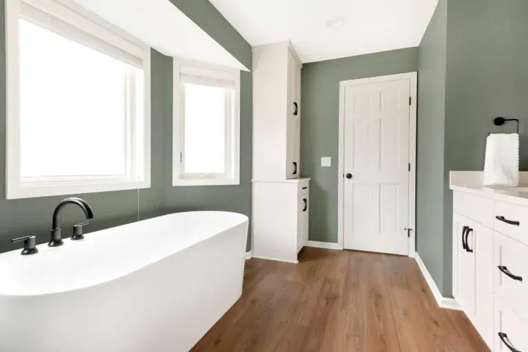
See how we incorporated an earthy shade of green in this 1980s primary bathroom renovation in Burnsville. By pairing green with white trim and matte black hardware, we created a space that feels natural and modern at the same time. |
How Light Affects Paint Color Choices
One of the most important considerations when picking a paint color is the lighting in your home. Paint can look drastically different in the store or on a screen compared to your actual space. But more than that, paint colors that look good with your current home layout and finishes can look completely different after a renovation.
Expect the Lighting to Change
If your remodel includes new windows, an open floor plan, higher ceilings, or new lighting, the way you see color in the room may also change. If your space felt dark and closed off before, you might have used lighter colors to brighten it up. With more natural light, you may actually find that you want to use slightly darker shades to avoid making the room feel too bright.
“Many times, homeowners feel like they have to go with the lightest color on the fan deck,” says JBDB designer Morgan Longhenry. “If it feels boring to you, go ahead and go a little darker! It will have more of an impact. Even just going one step darker will definitely make a difference.”
Test Paint in Different Lighting
You should never decide on your paint just by looking at it under the fluorescent lights at the store. “Be sure to look at your paint swatches in the room you’re going to be painting, and look at it during different times of the day: in bright sunlight, in the evening, on a cloudy day. It’s going to change,” says Morgan. “If you see any hint of color that’s not what you’re looking for, then find a different color because you’ll definitely see it when it’s painted on your walls.”
As you contemplate different swatches, hold them up to your wall throughout the day to see how these paint colors appear in different lighting conditions. It also helps to check how the paint looks under lamps and overhead lights versus natural light.
Consider Seasonal Light Changes
In northern states like Minnesota, it’s worth considering how paint colors look in different seasons, not just throughout the day. Because paint reflects the surrounding light, the same color can take on different qualities depending on whether it’s winter or summer.
Cool colors can feel crisp or refreshing in the summer, while making your space feel cold in the winter when there’s snow outside. At the same time, summer lawns and trees can reflect warmer tones into your room, making certain shades appear more green in the summer than they do in the winter.
How to Find Paint Colors You Love for Your Renovation
Ready to start narrowing down your choices for the perfect color? Here are a few tips from our designers at James Barton Design-Build to keep in mind.
Think About Your Renovation Goals
As you think about your remodeling project, consider the outcome you want for your final space. Are you aiming for a tranquil, relaxing space? A fun, vibrant vibe? Are you working with existing furniture, or do you have your eye on a statement piece to purchase? Stepping back and thinking about your bigger goals will help you get a sense of how your paint colors will help bring everything together.
Remember Each Space is Unique
Though it’s important to gather inspiration from different places, one of the most common mistakes homeowners make is thinking that the paint color they see on a designer’s Instagram or Pinterest page will be the right color for their home. Professional photos are edited or filtered, which can change how the paint color looks in their feeds.
Each and every wall, even within the same home, can make a paint color look different. No matter the color, you will want to pick a few different shades to test out on your walls before committing to a specific shade.
Think About the Size of the Space
Larger rooms tend to feel overwhelming when you choose intense colors, whether that means picking a statement shade or going dark. “If you’re going to be using one color in a large space, or on a few rooms that blend together, it’s usually best to go with a lighter gray to keep it more neutral,” Morgan says.
For a smaller room, you don’t have to play it too safe. “Many times, people think that they can’t use a darker paint in a small room, but it’s not nearly the issue they might think it is. A smaller, defined space, like a powder room, is a great place to do something bold! Don’t be afraid to use rich or intense shades to make an impact.”
Pay Attention to the Undertones
Morgan has an easy trick to find out a paint color’s undertone: “Look at the whole lineup on the fan deck, not just the paint swatch you like,” she said. “The darkest color will give it away the most. If the darkest color shows a lot of green in it, there will definitely be some green undertones in the color you’re considering.”
When looking at undertones, think about what else is in the room you are painting. Do you have dark, wooden floors, white oak, or lots of bright accents? Be sure to keep those in mind and ensure the paint complements the rest of the room.
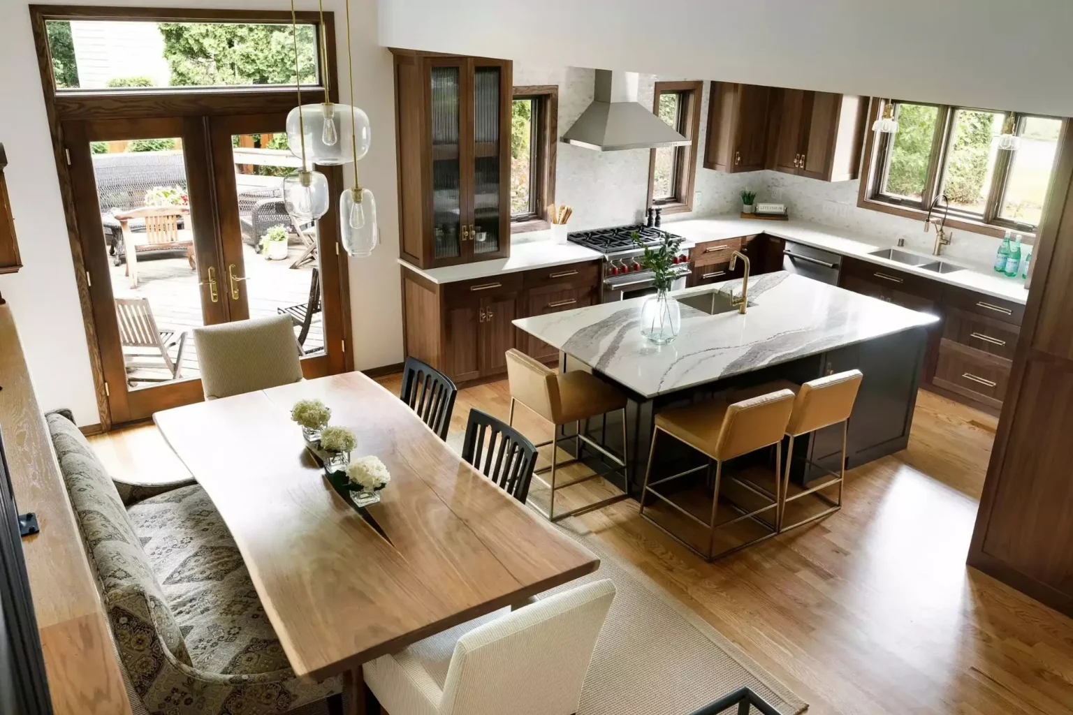
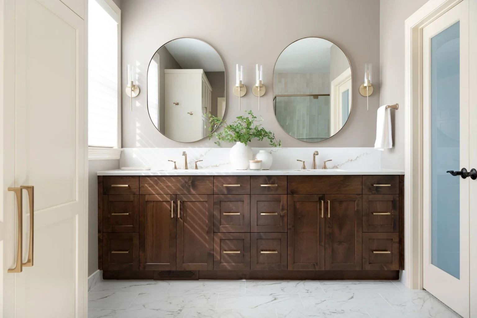
In this Eagan whole-home renovation, we balanced dark and light colors throughout the home to create a cohesive feel. By balancing the darker, warmer wood tones of the cabinets and trim with light tilework and neutral wall colors, the entire home feels intentional. |
How to Coordinate Paint Colors Throughout the House
When planning a renovation, it’s just as important to think about how your remodeled space will coordinate with areas of your home that you’re not currently updating. Paint colors can be a perfect way to make your renovation feel cohesive with other rooms.
You don’t necessarily need to repaint the rest of your home. However, you can choose new colors that naturally tie rooms together.
- Carry colors throughout your home. Popular kitchen paint colors tend to be light and neutral, but we also love designing kitchens with accent colors such as blue, green, or gray. Even if you’re not updating other areas of your home, incorporating the same accent color into your living room, hallways, or decor makes the whole space feel cohesive.
- Consider trim and door colors. Painting walls to match or coordinate with your renovation helps your home feel more connected. But you can also create a smoother transition between rooms by keeping a consistent color for your molding, doors, and door hardware. Updating select finishes or enameling trim throughout your home is an easy way to tie spaces together even if they aren’t fully renovated.
- Consider what you can see from each room. In an open-concept main floor, you’ll likely want your living room paint colors to coordinate with the kitchen because you can see both spaces at the same time. However, coordinating colors becomes a lower priority when rooms are completely disconnected from one another.
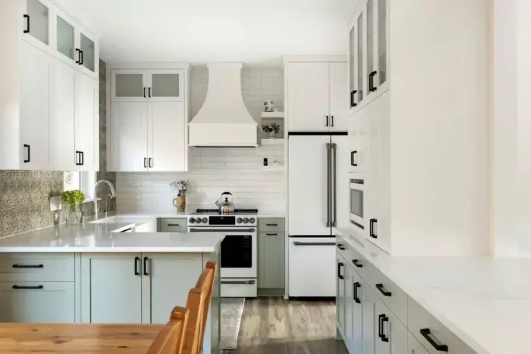
Check out how we incorporated sage-green lower cabinets in this Burnsville main-level renovation. By carrying the same shade of green from the kitchen cabinets into the mudroom and updating the millwork throughout the space, the renovation feels cohesive throughout the home. |
Create the Perfect Renovation Color Palette with James Barton Design-Build
For many homeowners, determining cool or warm undertones, understanding how natural light affects their paint choices, or choosing the right color to tie a design together can be a little too overwhelming. If you’re looking to update your home, talk to our Twin Cities design team to help you turn your ideas into reality.
The JBDB team will work with you throughout your remodeling projects to ensure every detail ties together perfectly and creates a space you love. Contact us today to find out more!
"*" indicates required fields
Dreaming of an Open Concept Floor Plan? Design Tips to Bring It All Together
October 20, 2026
Should You Add Radiant Floor Heating When Remodeling?
October 14, 2026
The Ultimate Pocket Door Renovation Guide
October 14, 2026